Saturday 19 September 2009

Never Too Busy

...For a couple more bags.


x

Friday 18 September 2009

Charity

Donate now.


x

Tuesday 15 September 2009

Special Delivery

Bit of a happy accident this one. I left all of my student finance papers at my summer residence and didn't receive a CD from play.com at that address until I had already returned to Leeds. Given the postal strikes and the need for a student loan (not to mention the CD), I got my amazing mother to post it all up Special Delivery. There was a downside however, it arrived at 7.30am. For a student on a summer break, not impressed.


Particularly like the combined use of light and bold weighting within the type as well as the half tone dots toward the top. This combined with the red underlining conveys a distinct impression of speed and movement.

Thank you Royal Mail, thank you Mother.

x

Sunday 13 September 2009

Blue Rinse

Arriving back in Leeds two days ago I felt the need to refamiliarise myself with what the city had to offer. As a keen admirer of old and rare materials, Blue Rinse caught my eye as a Vintage clothing store selling genuine items from the 50's, 60's and so on.


Despite not buying anything, I again managed to blag a free carrier using the classic 'I'm a student and need one for a project' as an excuse.

On this occasion though, the type didn't really interest me. The imagery however has been nicely half-toned to give a vintage feel that I admire particularly within screen printing.

x

Friday 11 September 2009

Magenta/Violet/Purple etc

Makes me feel warm inside.


x

Tuesday 8 September 2009

Haircut

Popped in for a cheeky pre-uni haircut today and managed to get my hands on one of these rather nice Matrix bags.

The typeface is sleek, stylish and connotes swiftness and efficiency. Just the right blend for a hairdressing brand in my opinion.

Again all upper case, sans serif and (given the typeface itself) probably bold.

x

Friday 4 September 2009

Tuesday 1 September 2009

LDN / MNC

Yes yes oh yay.


x

Friday 28 August 2009

Helvetica

I have to confess, I have a love/hate relationship with this typeface. On one hand it is gorgeous, efficient and just looks incredible on 95% of the design it is used within. On the other, it occasionally makes the job of a graphic designer too easy and is therefore just a pain in the arse. A dog could probably use this typeface and make something look pretty decent.

At this moment in time however, I love it.


x

Tuesday 25 August 2009

Tip Top

His and hers, quite interesting on a multitude of levels.


His: Bold, sans serif typeface. Upper case, direct and regimented. Printed in black. Rough textured paper carrier that is simple and square. Plain, straight forward white that is without any unnecessary curves or type.


Hers: Light, sans serif typeface. Upper case, direct but slightly less harsh. Printed in a light orange. Plastic carrier with curved upper edges. Plain, straight forward white without any unnecessary type.

Need I say more?

x

Wednesday 19 August 2009

Saturday 15 August 2009

Supermarkets Revisited

I was thinking last night about the sustainability issue(s) surrounding supermarket carrier bags and reminded myself about all of the 'bag for life' carriers that were being produced and sold in stores these days. I was compelled to go and get some...

With this one from Asda I wasn't at all surprised. Not in the slightest. The bag itself was green, the type was green and there were even two green love hearts toward the bottom of the composition. It definitely ticked all the right boxes for a 'greener future'. I had to laugh though, it's still plastic at the end of the day; there's just a lot more of it!

From a typographical aspect however, the bag contrasts to the common Asda carrier through the use of a serifed font which is presented in near enough all lower case. This definitely connotes a more 'homely' and endearing feel. A success on some level I guess?


In opposition, I was pleasantly greeted by this carrier upon making a trip to Marks and Spencer. Although it is made of a similar plastic substance, the graphic composition is definitely more interesting to the eye of a graphic designer. The range of corporate identity designs have a strong aesthetic appeal to me personally and are aimed to celebrate 125 years of the stores existence. I think I have a soft spot for this particular bag though as the logos also give a nostalgic feel. I'm not sure if they were all commissioned recently or represent the growth of Marks and Spencer over the years?

x

Friday 14 August 2009

Birthday Boy

On the topic of my little brother again, it is conveniently his birthday today. This provided me with the perfect opportunity to obtain a bag from Clinton Cards without having to use any made up excuses as to why I should just be given one for free.


On a personal level I am not a fan of the logo design for this company, it looks too effortless and 'scribbled'. They have used a nice shade of orange though to be fair.

The type along the bottom is aligned effectively...

www.clintoncards.com looks like another stretched Helvetica offender. This typeface truly gets everywhere!

x

Tuesday 11 August 2009

Plates of Meat

Feet. Had to pop into the town centre today to sort out my little brother with some new shoes for school. Naturally as any self -respecting graphic design student would, I grabbed a few bags along the way.


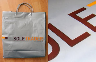
With this Sole Trader carrier I find the colour combination slightly odd, but as you would expect - it just works. The plastic colouring itself is what sets it off in my opinion and this is something that I intend to look at within my Design Production for Print brief. I did touch on printing with gold ink last year so ideally this would be something I build upon over the coming months.

In regards to the type, again it is all in upper case and uses a bold, sans serif typeface. No imagery however. Surprising?


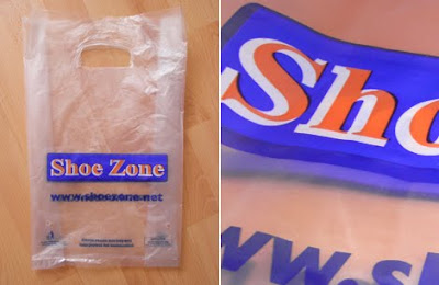
The one thing I like about this Shoe Zone carrier is the thought process behind the lettering. Although aesthetically it comes across as a bit of a disaster, the use of two different typefaces to produce a corporate identity is a clever technique that could be highly successful with a talented designer behind the steering wheel.

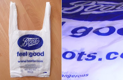
Also got a coke from Boots, thought that was quite fitting...


x

Saturday 8 August 2009